Introduction to advertising: key conventions
1) What key conventions of print adverts can you find and what are the connotations or deeper meanings of each convention? For each convention, write about how it communicates meaning to the audience. See the Maltesers advert above for an example of how to do this.
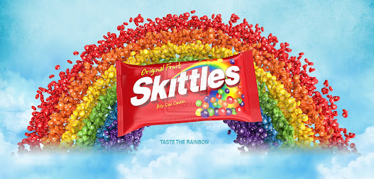
Picture of the product inside to remind you how it looks and how it is colourful.
The Logo is big and bright white so that when you see it its more attractive to the eyes. It uses big fonts and says its made from real fruits with bite size candy suggesting its for kids.
The Background is a rainbow in the clouds with skittles on it, you can presume that its referring to the slogan "Tase The Rainbow".
The Slogan stating "Taste the Rainbow" says the sweets are colourful and made for a younger audience.

Comments
Post a Comment